ok I'm trying to create a 3 column layout having left and right column containing pictures and the centre column containing text
similar to the image attached below, without borders of course. I also want the left and right column to be a fixed width but want the height to change as and when more text is entered into the centre column, there by changing the size of the pictures.
But I'm having trouble, either the floats fall out of the container, the pictures don't appear or they do stick to the width of the columns, any help with the html and css of this layout would be greatly appreciated. 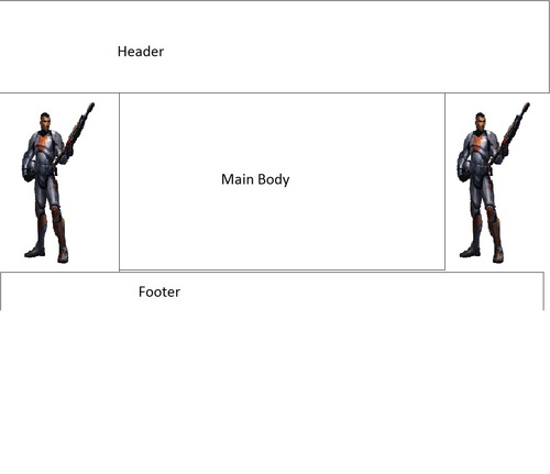
Thanks all
I used the position:absolute style to achieve this.
To play with the code that I used check out this.
To see the full screen result of the code I used see this.
Here is the code: - <!DOCTYPE html PUBLIC "-//W3C//DTD XHTML 1.0 Transitional//EN" "http://www.w3.org/TR/xhtml1/DTD/xhtml1-transitional.dtd">
-
<html xmlns="http://www.w3.org/1999/xhtml" dir="ltr" lang="en">
-
<head>
-
<title>3 column layout with pictures - HTML / CSS</title>
-
-
<style>
-
html {
-
background: #333333;
-
}
-
-
p{
-
padding:5px;
-
}
-
-
#wrapper{
-
position:absolute;
-
width: 50%;
-
margin:0 25%;
-
}
-
-
#content{
-
position:absolute;
-
}
-
-
#header,#footer {
-
overflow: hidden;
-
background: orange;
-
}
-
-
#footer{
-
width:100%;
-
z-index:3;
-
position:absolute;
-
}
-
-
#main {
-
width:80%;
-
background-color:white;
-
margin:0 auto;
-
overflow:hidden;
-
-
}
-
-
#left, #right {
-
display: inline-block;
-
position:absolute;
-
width:10%;
-
height:100%;
-
/*background: green url(line.png) repeat-y 50% 0;*/
-
}
-
-
#left {
-
background-color:blue;
-
}
-
#right {
-
background-color:green;
-
margin-left:90%;
-
}
-
</style>
-
-
-
</head>
-
<body>
-
<div id="wrapper">
-
<div id="header">
-
<h1>Header Section</h1>
-
</div>
-
<div id="content">
-
<div id="left"><img src="line.png" style="height:100%; width:100%;" /></div>
-
<div id="right"><img src="line.png" style="height:100%; width:100%;" /></div>
-
<div id="main">
-
<p>Main Body</p>
-
<p>Lorem ipsum dolor sit amet, consectetur adipiscing elit. Sed facilisis laoreet nulla fringilla tristique. Integer eu diam diam, nec blandit lorem. Aenean condimentum rutrum feugiat. Etiam lacinia cursus adipiscing. Duis dignissim felis nec nisi bibendum quis condimentum nunc adipiscing. Maecenas tristique mollis lectus sed dignissim. Proin nisl neque, fermentum in condimentum eu, gravida vel eros. Duis faucibus vestibulum ligula eu mattis. Etiam blandit justo nec risus cursus sollicitudin. Lorem ipsum dolor sit amet, consectetur adipiscing elit. Suspendisse venenatis, lectus vitae sagittis pharetra, magna sapien euismod neque, eget tempor ipsum metus at nisi. Cras condimentum, felis vitae vulputate tempor, ipsum quam aliquam dolor, in hendrerit est ante in nisl. Suspendisse quis arcu eu massa volutpat eleifend nec vel tellus.</p>
-
<p>Donec at tortor vitae nibh iaculis volutpat eu rutrum nulla. Mauris faucibus volutpat massa quis pretium. Duis odio est, feugiat a posuere ac, tincidunt non sem. Nam at nibh lacus, ac volutpat lacus. Quisque sit amet purus a augue condimentum accumsan sit amet sed quam. Cum sociis natoque penatibus et magnis dis parturient montes, nascetur ridiculus mus. Cras non sapien eget justo scelerisque euismod vitae sit amet arcu.</p>
-
<p>Pellentesque eget sem quis libero laoreet gravida. Quisque mi velit, porttitor quis vestibulum at, hendrerit sit amet lorem. Morbi interdum magna at neque laoreet hendrerit. Nam ultricies laoreet sapien, non laoreet nunc vulputate mollis. Quisque a orci vitae magna porta ornare. Donec ipsum lectus, suscipit a laoreet ac, mattis vitae urna. Morbi pharetra mauris venenatis arcu tincidunt sed auctor odio vestibulum. Ut et nibh tellus, convallis lacinia ligula. Maecenas nisi nulla, congue at adipiscing faucibus, luctus vel turpis.</p>
-
<p>Aenean risus orci, aliquet ut interdum vel, molestie sit amet tortor. Duis eu purus diam, id molestie lacus. Fusce eget nisi at tellus aliquet rutrum nec semper mauris. Duis nisi leo, sagittis gravida volutpat non, viverra ac est. Pellentesque habitant morbi tristique senectus et netus et malesuada fames ac turpis egestas. Quisque interdum faucibus egestas. Sed dolor purus, luctus ut egestas at, scelerisque eu elit. Fusce ante nunc, posuere ac ullamcorper sed, lacinia in odio. Integer eget nisl orci. Quisque in mattis neque. Nunc libero massa, condimentum a eleifend vitae, tincidunt ut felis. Ut ultrices, risus id tincidunt dignissim, lacus tellus convallis turpis, sit amet scelerisque est felis ac massa. Aenean accumsan est at ante tincidunt sit amet ornare ligula sollicitudin. Nunc arcu nulla, molestie at sodales nec, ultrices dapibus est. Suspendisse id sem velit, vel semper elit.</p>
-
<p>Aliquam erat volutpat. Duis tortor augue, eleifend fermentum cursus eget, luctus a sapien. Etiam massa odio, sollicitudin nec ullamcorper eget, cursus in arcu. Suspendisse sed augue orci. Morbi mollis sem at dui laoreet lobortis. Vestibulum vestibulum velit et felis fringilla ultrices. Aenean commodo nisi a felis eleifend eget consequat purus consequat. Quisque dignissim, arcu et scelerisque congue, tortor diam lacinia purus, eu vulputate urna sem nec leo. Aenean lorem massa, pellentesque vitae scelerisque hendrerit, vulputate eu est. Aenean at pretium risus. Sed dui quam, sodales et ullamcorper ut, fringilla non libero. Morbi mattis ornare fermentum. Cras blandit scelerisque molestie. </p>
-
</div>
-
<div id="footer">
-
<p>footer section</p>
-
</div>
-
</div>
-
-
</div>
You'll have to replace the image source with a valid image of your own. You can either use the <img /> tags in the left and right columns to display your images or you could remove those elements and set the background of the left and right columns to the image that you desire.
-Frinny
8  2036 2036 
Thanks for the response and the link, but the 3 column layout isn't the problem I can do that. As stated in my post I want the left and right column to contain a picture that increases in size based on the amount of text in the centre column, that's what I'm having trouble with.

I used the position:absolute style to achieve this.
To play with the code that I used check out this.
To see the full screen result of the code I used see this.
Here is the code: - <!DOCTYPE html PUBLIC "-//W3C//DTD XHTML 1.0 Transitional//EN" "http://www.w3.org/TR/xhtml1/DTD/xhtml1-transitional.dtd">
-
<html xmlns="http://www.w3.org/1999/xhtml" dir="ltr" lang="en">
-
<head>
-
<title>3 column layout with pictures - HTML / CSS</title>
-
-
<style>
-
html {
-
background: #333333;
-
}
-
-
p{
-
padding:5px;
-
}
-
-
#wrapper{
-
position:absolute;
-
width: 50%;
-
margin:0 25%;
-
}
-
-
#content{
-
position:absolute;
-
}
-
-
#header,#footer {
-
overflow: hidden;
-
background: orange;
-
}
-
-
#footer{
-
width:100%;
-
z-index:3;
-
position:absolute;
-
}
-
-
#main {
-
width:80%;
-
background-color:white;
-
margin:0 auto;
-
overflow:hidden;
-
-
}
-
-
#left, #right {
-
display: inline-block;
-
position:absolute;
-
width:10%;
-
height:100%;
-
/*background: green url(line.png) repeat-y 50% 0;*/
-
}
-
-
#left {
-
background-color:blue;
-
}
-
#right {
-
background-color:green;
-
margin-left:90%;
-
}
-
</style>
-
-
-
</head>
-
<body>
-
<div id="wrapper">
-
<div id="header">
-
<h1>Header Section</h1>
-
</div>
-
<div id="content">
-
<div id="left"><img src="line.png" style="height:100%; width:100%;" /></div>
-
<div id="right"><img src="line.png" style="height:100%; width:100%;" /></div>
-
<div id="main">
-
<p>Main Body</p>
-
<p>Lorem ipsum dolor sit amet, consectetur adipiscing elit. Sed facilisis laoreet nulla fringilla tristique. Integer eu diam diam, nec blandit lorem. Aenean condimentum rutrum feugiat. Etiam lacinia cursus adipiscing. Duis dignissim felis nec nisi bibendum quis condimentum nunc adipiscing. Maecenas tristique mollis lectus sed dignissim. Proin nisl neque, fermentum in condimentum eu, gravida vel eros. Duis faucibus vestibulum ligula eu mattis. Etiam blandit justo nec risus cursus sollicitudin. Lorem ipsum dolor sit amet, consectetur adipiscing elit. Suspendisse venenatis, lectus vitae sagittis pharetra, magna sapien euismod neque, eget tempor ipsum metus at nisi. Cras condimentum, felis vitae vulputate tempor, ipsum quam aliquam dolor, in hendrerit est ante in nisl. Suspendisse quis arcu eu massa volutpat eleifend nec vel tellus.</p>
-
<p>Donec at tortor vitae nibh iaculis volutpat eu rutrum nulla. Mauris faucibus volutpat massa quis pretium. Duis odio est, feugiat a posuere ac, tincidunt non sem. Nam at nibh lacus, ac volutpat lacus. Quisque sit amet purus a augue condimentum accumsan sit amet sed quam. Cum sociis natoque penatibus et magnis dis parturient montes, nascetur ridiculus mus. Cras non sapien eget justo scelerisque euismod vitae sit amet arcu.</p>
-
<p>Pellentesque eget sem quis libero laoreet gravida. Quisque mi velit, porttitor quis vestibulum at, hendrerit sit amet lorem. Morbi interdum magna at neque laoreet hendrerit. Nam ultricies laoreet sapien, non laoreet nunc vulputate mollis. Quisque a orci vitae magna porta ornare. Donec ipsum lectus, suscipit a laoreet ac, mattis vitae urna. Morbi pharetra mauris venenatis arcu tincidunt sed auctor odio vestibulum. Ut et nibh tellus, convallis lacinia ligula. Maecenas nisi nulla, congue at adipiscing faucibus, luctus vel turpis.</p>
-
<p>Aenean risus orci, aliquet ut interdum vel, molestie sit amet tortor. Duis eu purus diam, id molestie lacus. Fusce eget nisi at tellus aliquet rutrum nec semper mauris. Duis nisi leo, sagittis gravida volutpat non, viverra ac est. Pellentesque habitant morbi tristique senectus et netus et malesuada fames ac turpis egestas. Quisque interdum faucibus egestas. Sed dolor purus, luctus ut egestas at, scelerisque eu elit. Fusce ante nunc, posuere ac ullamcorper sed, lacinia in odio. Integer eget nisl orci. Quisque in mattis neque. Nunc libero massa, condimentum a eleifend vitae, tincidunt ut felis. Ut ultrices, risus id tincidunt dignissim, lacus tellus convallis turpis, sit amet scelerisque est felis ac massa. Aenean accumsan est at ante tincidunt sit amet ornare ligula sollicitudin. Nunc arcu nulla, molestie at sodales nec, ultrices dapibus est. Suspendisse id sem velit, vel semper elit.</p>
-
<p>Aliquam erat volutpat. Duis tortor augue, eleifend fermentum cursus eget, luctus a sapien. Etiam massa odio, sollicitudin nec ullamcorper eget, cursus in arcu. Suspendisse sed augue orci. Morbi mollis sem at dui laoreet lobortis. Vestibulum vestibulum velit et felis fringilla ultrices. Aenean commodo nisi a felis eleifend eget consequat purus consequat. Quisque dignissim, arcu et scelerisque congue, tortor diam lacinia purus, eu vulputate urna sem nec leo. Aenean lorem massa, pellentesque vitae scelerisque hendrerit, vulputate eu est. Aenean at pretium risus. Sed dui quam, sodales et ullamcorper ut, fringilla non libero. Morbi mattis ornare fermentum. Cras blandit scelerisque molestie. </p>
-
</div>
-
<div id="footer">
-
<p>footer section</p>
-
</div>
-
</div>
-
-
</div>
You'll have to replace the image source with a valid image of your own. You can either use the <img /> tags in the left and right columns to display your images or you could remove those elements and set the background of the left and right columns to the image that you desire.
-Frinny
Thx Frinavale I'll give it a try, I'll let ya know how it goes.
- <!DOCTYPE html>
-
<html>
-
<body>
-
-
<div id="container" style="width:500px">
-
-
<div id="header" style="background-color:#FFA500;">
-
<h1 style="margin-bottom:0;">Main Title of Web Page</h1></div>
-
-
<div id="menu" style="background-color:#FFD700;height:200px;width:100px;float:left;">
-
<b>Menu</b><br>
-
HTML<br>
-
CSS<br>
-
JavaScript</div>
-
-
<div id="content" style="background-color:#EEEEEE;height:200px;width:400px;float:left;">
-
Content goes here</div>
-
-
<div id="footer" style="background-color:#FFA500;clear:both;text-align:center;">
-
Copyright@</div>
-
-
</div>
-
-
</body>
-
</html>
@sharmahemal, the code you posted will display 2 column format,and the columns do not stretch to the content...
-Frinny
yes i know that but if he edit this code he will surely making to given image table.
thx for all the responses, I'm gonna use the code that Franavale suggested, it works like a charm.
Sign in to post your reply or Sign up for a free account.
Similar topics
by: Doug McCrae |
last post by:
http://www.btinternet.com/~doug.mccrae/go4learning/index.html
As it says in the subject, a two column layout (plus header and footer
boxes). I feel the left column really needs to be fixed width...
|
by: Eric |
last post by:
I would like to setup a two column layout for my web page using CSS.
I would like the Left column width to be auto.
Can I have the right column be offset by 8 pixels from the right edge of
the...
|
by: Dan V. |
last post by:
How do you do a css 2 column layout with header and footer, with the 2nd
column
auto-stretching so entire page looks good for 800 x 600 resolution as min.
and 1024 x 768 resolution as a max?
...
|
by: kaeli |
last post by:
I have had a little free time lately to revisit a problem I have with the 3
column layout plus a header and footer.
See this example:
http://glish.com/css/7.asp
There is a header and 3...
|
by: Tamblyne |
last post by:
This problem has got to have a simple solution and I can't be the first
person who has ever handled it. Perhaps Google is no help because I'm
not using the right terms? (I did find one post...
|
by: ckirchho |
last post by:
Halo,
I am trying to realize a two column layout basically like this:
<html>
<head>
<style>
leftCol {
float: left;
width: 15em;
}
|
by: Philipp E. Imhof |
last post by:
Hi!
I am experiencing a problem with a two-column layout -- apparently I
am not the first person, but the solutions I found in GG did not
give me what I was looking for.
The page should be as...
|
by: TristaSD |
last post by:
Hi,
How do I accomplish the following:
In a two-column layout, the right column is 200px wide, and the left
column is fluid?
Thanks!
|
by: =?ISO-8859-1?Q?Ney_Andr=E9_de_Mello_Zunino?= |
last post by:
Hello.
I seek confirmation for the reasons behind a margin-related behavior I
have observed. I have set up a simple test page to illustrate the
issue. The page shows a very simple 2-column...
|
by: Death Slaught |
last post by:
I will be showing you how to make a very simple but effective three column layout.
First we will begin with the HTML, or structure, of our three column layout.
<!DOCTYPE html PUBLIC...
|
by: Charles Arthur |
last post by:
How do i turn on java script on a villaon, callus and itel keypad mobile phone
|
by: emmanuelkatto |
last post by:
Hi All, I am Emmanuel katto from Uganda. I want to ask what challenges you've faced while migrating a website to cloud.
Please let me know.
Thanks!
Emmanuel
|
by: BarryA |
last post by:
What are the essential steps and strategies outlined in the Data Structures and Algorithms (DSA) roadmap for aspiring data scientists? How can individuals effectively utilize this roadmap to progress...
|
by: nemocccc |
last post by:
hello, everyone, I want to develop a software for my android phone for daily needs, any suggestions?
|
by: Hystou |
last post by:
There are some requirements for setting up RAID:
1. The motherboard and BIOS support RAID configuration.
2. The motherboard has 2 or more available SATA protocol SSD/HDD slots (including MSATA, M.2...
|
by: marktang |
last post by:
ONU (Optical Network Unit) is one of the key components for providing high-speed Internet services. Its primary function is to act as an endpoint device located at the user's premises. However,...
|
by: Oralloy |
last post by:
Hello folks,
I am unable to find appropriate documentation on the type promotion of bit-fields when using the generalised comparison operator "<=>".
The problem is that using the GNU compilers,...
|
by: jinu1996 |
last post by:
In today's digital age, having a compelling online presence is paramount for businesses aiming to thrive in a competitive landscape. At the heart of this digital strategy lies an intricately woven...
|
by: tracyyun |
last post by:
Dear forum friends,
With the development of smart home technology, a variety of wireless communication protocols have appeared on the market, such as Zigbee, Z-Wave, Wi-Fi, Bluetooth, etc. Each...
| |